How to Wireframe your Home Page
In this tutorial we will be making a home page wireframe for our example project of Raise the Bar Fitness website.
The home page should be your one stop shop for your users. It should have the most important information and links for your users to access. The home page should also clearly define what your website is about. For our example we will have a slideshow, links to available classes, class schedules, gym locations, and a Facebook feed. Other information might include rates, gym hours, phone numbers, addresses, and email addresses.
Things you will need:
- Photoshop
- 960 grid system PSD file
Download
You can downloaded the 960 grid system PSD file on their website by clicking the Big ol Download Button. Once you have downloaded the zip file and unzipped it the PSD files will be located in the templates->photoshop folder. Double click on the 960_grid_12_col.psd file.
It will look like this.
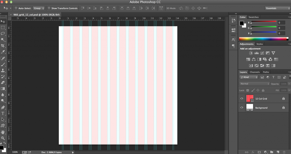
960 Grid System Explained
960 grid system is a 960px wide container with a 10px padding on the left and right. Your content therefore sits inside a 940px container. The columns are 60px wide with a 20px gutter. You can check out the 960 demo chart that displays the widths of the containers that we will be using.
The Header
When it comes to laying out your logo, search bar, and navigation don’t try to reinvent the wheel! Place the logo and navigation in areas where users expect them to be. In our case the logo is on the upper left, the search bar is on the upper right, and the nav is just under the logo.
Utility Menus
Utility menus are usually placed on the upper left or right of a website away from the main menu. If you checkout Macy’s, Nordstrom, or H&M website they all have a main menu across the web page but above the main menu they all have a utilities menu to the upper left or upper right where users can click sign in, my account, and store locations. For our example our utilities menu will be About, Careers, and Contact.
Lets get started!
Step 1
Let’s rename and save our PSD file.
Click file->Save As and rename it as wireframes.psd.
Step2
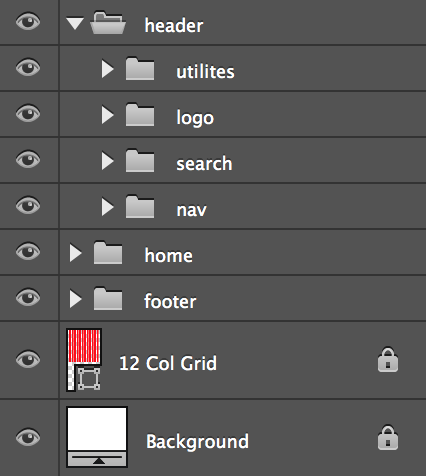
Lets make some folders to hold our elements.
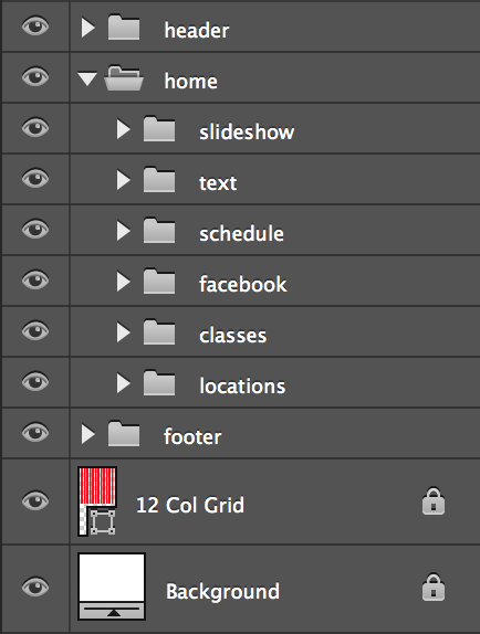
Click on the folder icon in the lower right corner to create new folders. We will be making 7 folders header, utilities, logo, search, nav, home, and footer. The utilities, logo, search, and nav folders will be nested inside the header folder.
Step 3
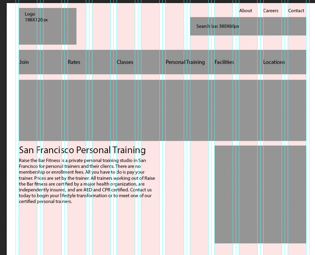
Lets work on the logo. Click on the rectangle tool and drag a rectangle. I will be making a rectangle of 188X120px because those are the dimensions of Raise the Bar Fitness logo. I have placed my logo rectangle in the top left.
Step 4
Lets add the Utilities menu. Use the text tool to make text layers for About, Careers, and Contact. Place the text layers in the upper right corner and make sure that they are aligned to the blue guidelines.
Step 5
Lets work on the search bar. Use the rectangle tool and drag a rectangle. I made a rectangle of 380X60px and placed it in the upper right corner just under the Utilities menu.
Step 6
Lets work on the nav. Use the rectangle tool and drag a rectangle of 940X80px and place it under the logo rectangle.
It will look like this
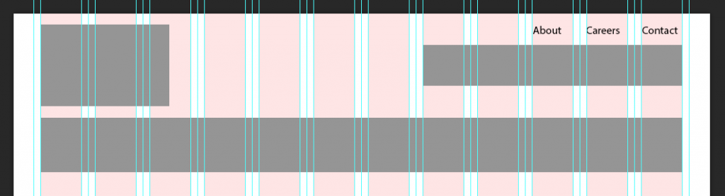
A couple of things to notice here, all the rectangles are aligned to the blue guidelines and my rectangle layers are in their corresponding folders in the layers panel.
Step 7
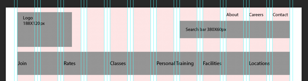
Lets add some text to better identify our rectangles. Use the text tool and add some text. I have added text layers to my elements with their dimensions. I have also added the main menu text from our Information Architecture, notice that my main menu links are inside two columns and aligned to the guidelines.
It will look like this
The Content
Step 1
Lets work on the home folder.
Click on the folder icon on the lower right corner and create folders for slideshow, text, schedule, facebook, classes, and location. Nest these folders in the home folder.
Step 2
Lets work on the slideshow. Use the rectangle tool and drag a rectangle. I made a rectangle of 940X300px and placed it under the main nav.
Step 3
Lets work on the text folder. Use the text tool and drag a rectangle. I made a rectangle of 460X200px and placed it under the slideshow on the left. I added some text here but you could always use some dummy text from lorem ipsum.
Note: The text folder is where you would add your h1 and keyword dense paragraph for SEO purposes.
Step 4
Lets work on the schedule folder. Use the rectangle tool and drag a rectangle. I made a rectangle of 300X300px and placed it on the right side just under the slideshow.
It will look like this
Step 5
Lets work on the facebook folder. Use the rectangle tool and drag a rectangle. I made a rectangle of 300X300px and placed it under the schedule rectangle.
Step 6
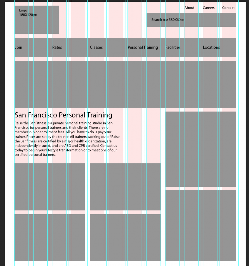
Lets work on the classes folder. I know that Raise the Bar Fitness has classes for pilates, bootcamp, yoga, and kickboxing. So I will start by making a new folder named pilates and nest it inside the classes folder. I will then use the rectangle tool and drag a rectangle of 300X200px and place it just under the text layer.
Step 7
I will now right click the pilates folder and select duplicate group. Rename the folder bootcamp and drag that rectangle to the right of the pilates rectangle. I will repeat this process 2 more times, renaming the folders yoga and kickboxing. I then placed the rectangles below one another.
It will look like this
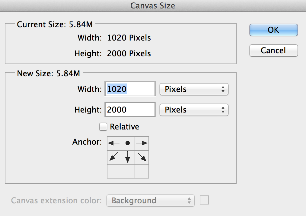
Note: If you find that you are running out of space at the bottom you can extend the canvas by clicking Image->Canvas Size. Change the anchor point so that it is center top and change the height. I changed my height to 2000 so I could have some more room to work.
Step 8
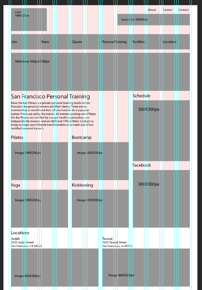
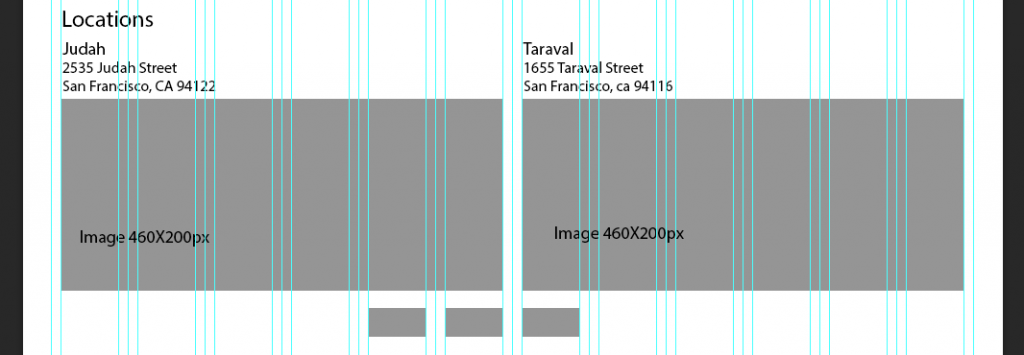
Lets work on the locations folder. I know that Raise the Bar Fitness has 2 locations so I will first make a new folder and name it judah. I will then nest it inside the locations folder. I then select the rectangle tool and drag a rectangle of 460X200px. I place the rectangle just under the classes rectangle.
Step 9
I will now right click the judah folder and select duplicate group. Rename the folder taraval and drag that rectangle to the right of the judah rectangle.
Step 10
Lets add some text to better identify our rectangles. Use the text tool and add some text layers. I have added text layers to my elements with their dimensions and added text layers identifying what my rectangles are.
It will look like this
The Footer
When designing your footer try to keep in mind what is most beneficial for your users when they reach the bottom of your website. For our case we will keep the footer simple. We will have the copyright information, phone number, social media icons, and links to join now, classes, and contact us.
A lot of times in the footer you might see the main menu repeated but our information architecture is quite simple so it won’t be necessary.
Step 1
Lets work on the footer folder. Click on the folder icon in the lower right corner to create new folders. We will be making 2 folders social media and join now btn. These folders will be nested in the footer folder.
Step 2
Lets work on the social media folder. First create a new folder and rename it facebook. Then nest in inside the social media folder. Click on the rectangle tool and drag a rectangle. I have made a rectangle of 60X30px and placed below the location rectangles 4 columns over.
Step 3
I will now right click the facebook folder and select duplicate group. Rename the folder twitter and drag that rectangle to the right of the facebook rectangle. I will repeat this one more time and rename the folder google+.
it will look like this
Step 4
Lets work on the join now btn folder. Click on the rectangle tool and drag a rectangle. I have made a rectangle of 220X108px and placed below the social media icons rectangles 3 columns over.
Step 5
I will now right click the join now btn folder and select duplicate group. Rename the folder classes btn and drag that rectangle to the right of the join now btn rectangle. I will repeat this one more time and rename the folder contact us btn.
Step 6
Finally I will make a new text layer and add the copyright information. I will place this text layer below the previous buttons I made.
It will look like this
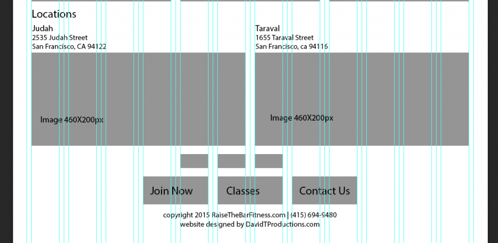
You will notice that I added text to the buttons of Join Now, Classes, and Contact Us.
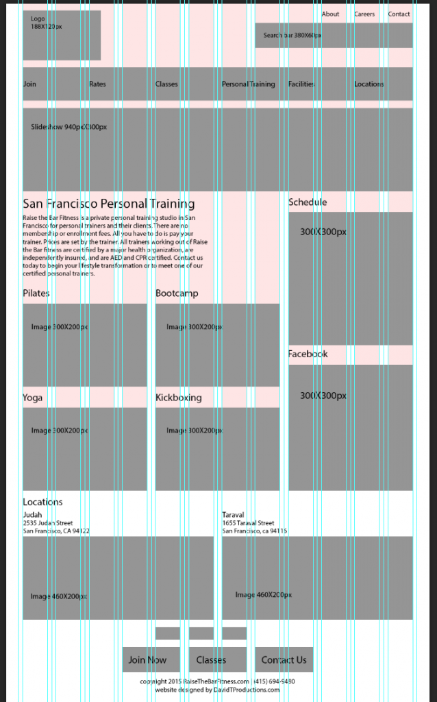
The complete home page wireframe will look like this
Whew! That was a long one, our next tutorial will be how to make wireframes for your gateway pages!
Download the completed Home Page Wireframe PSD file.
Further Reading
A good book to checkout is Don’t Make Me Think, Revisited: A Common Sense Approach to Web Usability (3rd Edition) by Steve Krug. This book does a great job describing how to layout your website and what users are thinking when they visit a web page. Checkout your local libraries to see if they have any copies to checkout.